The Game Scene
Here's a screenshot of the latest build of Patterns of the Wind running in the simulator with screen updates highlighted.
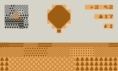
The highlighted areas show what is being updated every frame. In Pulp this is usually the player and anything drawn in the player draw event.
The mini-map in the top left is simply the active room, using crop to limit it's size, config.follow to centre it on the player, and config.followCenterX and config.followCenterY to position it in the top-left corner of the screen. The player tile itself isn't hidden with hide but is instead a completely transparent tile as there is an accessibility option to enable various map markers and that is more simply implemented by just swapping the player tile, hence the player tile is highlighted as being updated in the centre of the mini-map.
The HUD in the top right is made up of up to five labels and a draw. The current count of fame and supplies are both a label, as is the wind direction arrow. There are separate labels conditionally drawn to show changes to fame and supplies - here only a change in fame is visible. All of these labels are using only font characters, with the fame and supplies icons actually repurposed % and $ characters for efficiency. The icon to the left of the wind direction arrow which conveys when the balloon will be blown by the wind is by contrast a world tile displayed with draw. There are 17 variations of that icon hence not enough free font characters for it to optimised in that way!
The balloon itself is six labels, mostly containing only font characters. The exceptions are the four diagonal sides which are each embedded twice. These are player tiles so that they can make use of transparency. That transparency isn't evident in this screenshot but if you watch the gif in my previous post you can see how the balloon overlaps the background nicely on those diagonals.
Finally and most notably the view of the landscape at the bottom of the screen is another six labels, each spanning the width of the screen and only including font characters. This is necessary for good performance and is a trick I am reusing from my game Daedalus Versus Minotaur.
The font character table in the current build actually looks like this:
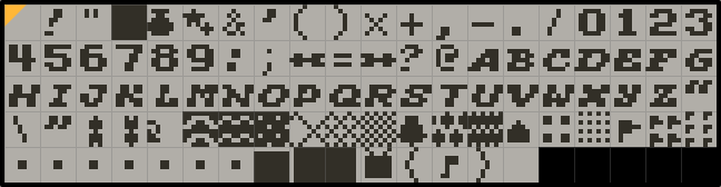
As you can see a lot of the characters have been repurposed for the sake of performant visuals!
Generating those six labels making up the view is itself heavily optimised to be performant, but that's a topic for another post. Instead I'll end this post by showing the map screen which the player can pull up by pressing "B". The map shows the full extent of the current playable area i.e. the room is still cropped, but to a larger area and not following the player.
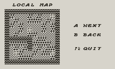
You should be able to match the mini-map in the first screenshot to this larger map. The lack of a map marker by default is a deliberate choice to emulate the act of consulting a paper map as opposed to a digital HUD, although as I mentioned before an optional map marker can be enabled for players who want one.
The maps are procedurally generated and in this example you can see a river as well as the patchwork of trees and fields and four towns. Not all maps follow the same rules and I'll go into much more detail on my approach to procgen of maps and wind patterns in the next post!