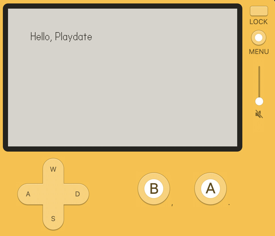
The default Playdate font is very small and thin when calling playdate.graphics.drawText("Hello, Playdate", 40, 40). I tend to think it's this way to encourage you to switch it out for another more legible font.
But when prototyping or making small games, it'd be nice to just be able to use a more legible font. When reading through the C example code in the SDK, I noticed const char* fontpath = "/System/Fonts/Asheville-Sans-14-Bold.pft"; ![]()
Lo and behold, there are a few different system fonts included that games can access!
font = playdate.graphics.font.new("/System/Fonts/Asheville-Sans-14-Bold.pft")
playdate.graphics.setFont(font)

function playdate.update()
  playdate.graphics.clear()
  playdate.graphics.drawText("Hello, Playdate", 40, 40)
end
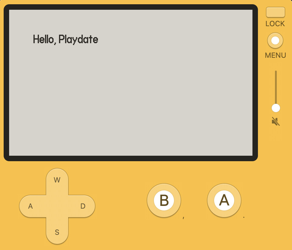
Ah, so much easier to read.
I did printTable(playdate.file.listFiles("/System/Fonts")) and here's what we've got available:
{
	Asheville-Sans-14-Bold.pft,
	Asheville-Sans-14-Light-Oblique.pft,
	Asheville-Sans-14-Light.pft,
	Asheville-Sans-24-Light.pft,
	Roobert-10-Bold.pft,
	Roobert-11-Bold.pft,
	Roobert-11-Medium.pft,
	Roobert-20-Medium.pft,
	Roobert-24-Medium.pft,
}
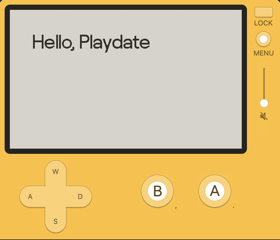
So many options. Roobert 24 Medium is handsome:
Now I'd imagine these are pretty stable. But I wouldn't rely on them being there in your shipped game. Better to put the needed font files in your game. But these are much better than the default font for prototyping and experimenting before you settle into the fonts you want to use. ![]()